Order on Amazon Now!
Get the book from Amazon now!
Categories
Popular Posts in July

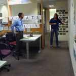


Last year, I wrote about the communication cadence and, in particular, the daily feature wall stand-up that was the heartbeat of the EDW Agile Release Train. Recently, I received an email from someone who had read this post and wanted to know more. As he quite rightly pointed out, the "post lacked the details to implement a similar event effectively, but it sounded really worthwhile."
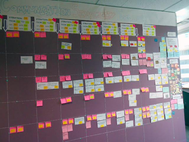
When I sat down to reply to this e-mail, I found myself thinking about the power of the visualisations more than the event. The inwards-facing Release Train Engineer had been determined since the birth of the EDW Release Train to create a physical dashboard that represented the performance of the system.
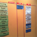
The first incarnation of the "feature wall" provided a 10-iteration view of what each feature team planned to work on. At first, it was the RTE's hope that the ScrumMasters would self-organise a consistent approach to visualising the work, but it was not long before his OCD kicked in, and he prescribed a legend. Large white cards for features in play, large green cards for features in discovery, small pink cards for defects and small blue cards for innovation work. Teams would visualise their plan for each feature by placing cards and an effort estimate in the relevant iterations. Each team showed the capacity they had available (based on historical velocity and planned leave) and the amount of work they planned to complete each sprint. This 10-iteration view also helped us plan our involvement in the enterprise release integration testing for those occasions when we could not decouple our deployments from an enterprise release.
You can always tell a good wall by the conversations that are had at it, and there was always plenty of conversation at this wall, mainly about capacity and forward planning. After a while, the RTE reached the conclusion that while these discussions might be interesting to the Project Management / Pipeline folk, they were not the right conversations. The conversations taking place were predominantly about how to get more work onto the train. It was a view of capacity management that didn't truly take into account what people were actually doing and how full the train was.
The feature wall stand-up was becoming a daily team status report, and in the RTE's view, we needed to be talking about the work. With this in mind, he redesigned the dashboard with a view to visualising the flow (or lack thereof) of the work through the system. He was also determined to improve the capture of cycle time metrics, with the intention of one day moving away from story point-based estimation and instead using the past performance of the system as a key factor in determining future performance.
The RTE convinced me that the new wall was worth trying, but I didn't want to lose the capacity view. In the end, he waited until I was away from the office for a couple of weeks, then replaced the capacity wall with the feature flow view, and chaos ensued. We no longer had a capacity view, and it quickly became apparent that our ability to visualise capacity was key to enabling the Pipeline to manage expectations and smooth the flow of demand to the feature teams. While the feature flow helped development services expose what was happening to them, it caused a problem for the pipeline, which still had to maintain a relationship with the business and ensure the survival of the teams. Creating harmonious change is not easy. (Many months later, this would get resolved through our improved rolling wave planning and reunification sessions, which emerged from our experiment with PI Planning.)
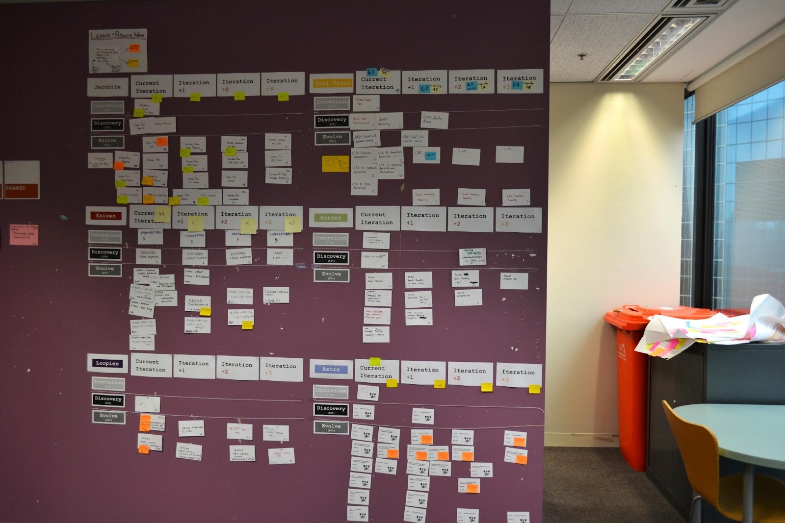
Our first attempt at visualising feature flow was actually at the epic level as we, for the most part, only deployed to production once all the features in an epic were complete. This was a wake-up call for me. Despite preaching that features should adhere to INVEST in the same way as user stories - independence was clearly an issue for us! In this early version, the visualisation was still very team-centric. The card colours represented teams, and the charts along the top were team cumulative flow and sprint goals.
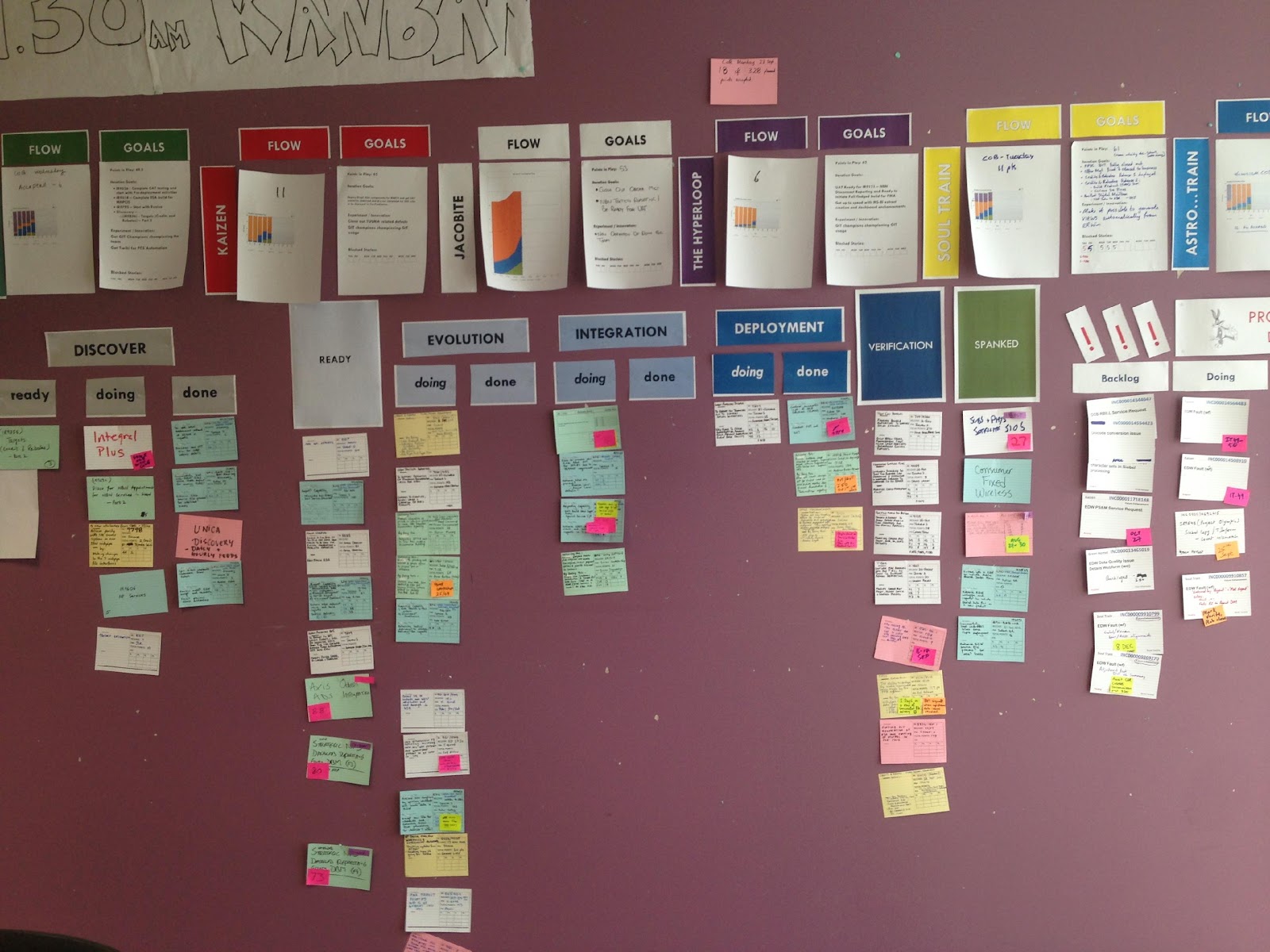
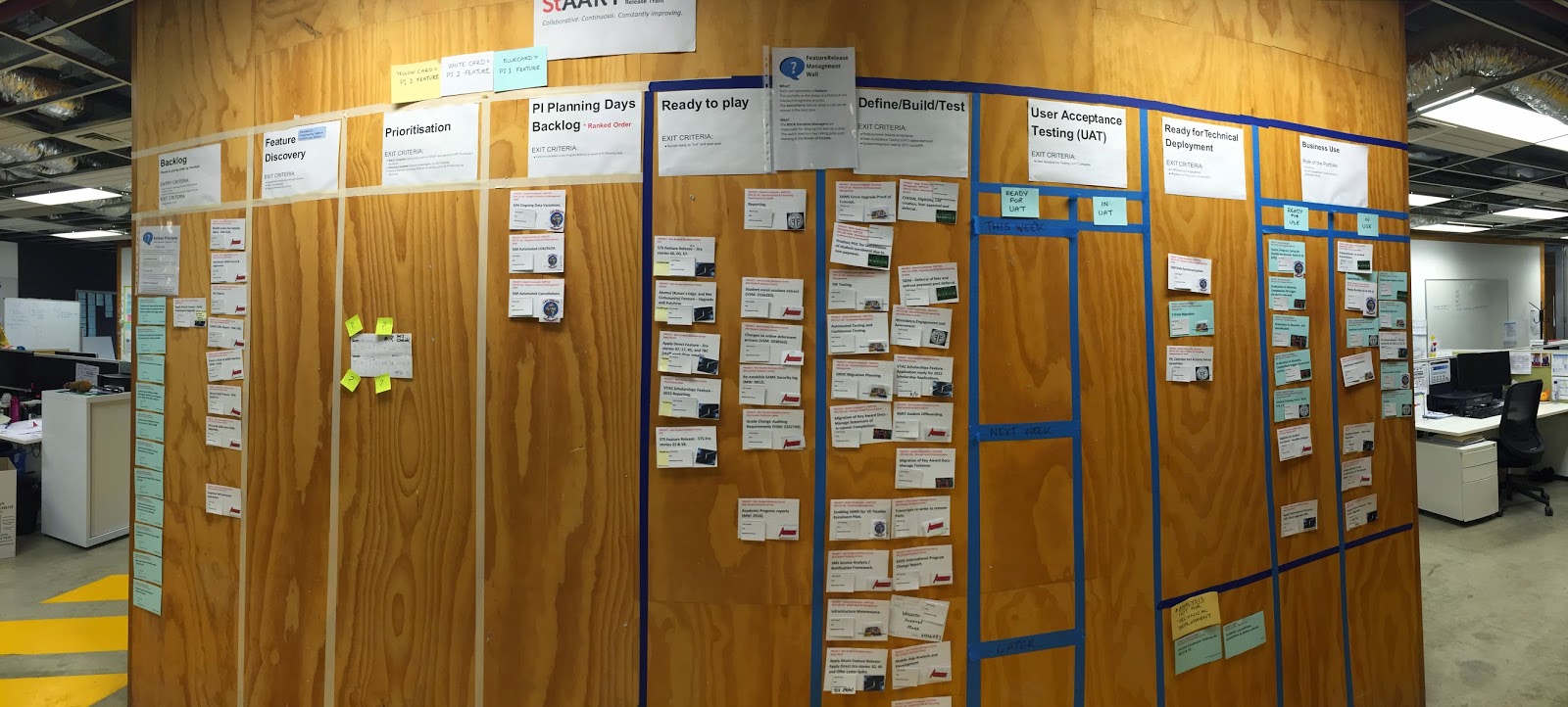
By the time I left the EDW Release Train, we had evolved to the view I call “feature flow”, which was far more aligned with the original intent than our first attempt. We retained the three separate kanbans (on the one wall) but shifted the focus to the flow of features through the train.
The first Kanban board showed the flow of epics through "discovery", the inception work the feature teams did with their business stakeholders to break down epics into features and provide an estimate of effort that could be used to inform funding and prioritisation decisions. (Remembering, of course, that the EDW Release Train never implemented PIs in the way prescribed by SAFe).
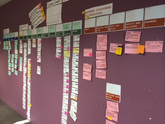
The second Kanban was the main focus area. It visualised the flow of features through the train/feature teams. As you can see in both the photos, visualising flow highlighted a couple of problems. We were struggling to move work through business verification (the second last state), and with each deployment, we added to the problem. This information had a huge impact on the system of work. We discovered that many of the business verification problems could have been resolved in the inception phase if we had just asked the right questions. We also discovered we had a WIP problem! This kinda jumped out at us when we ran out of wall space! To quote the RTE: “I am a firm believer in 3D walls - if people are having to physically step over the work, it does make it more real - think of the switch catalyst!”
The third kanban visualised the production defects the team was responsible for fixing. We had a simple rule: "You break it, you fix it!". If a team pushed "crappy code" to production, then that team would need to clean up their own mess. The other data collected and displayed on the later version of the feature wall were train-level metrics such as average cycle time and the number of features in WIP.
Of course, none of this really talks to the question of "how the feature wall stand-up worked" other than highlighting the need to create the right visualisations to support the conversation!
The feature wall stand-up was facilitated by the inward-facing Release Train Engineer and was held daily straight after the feature team stand-ups. The Iteration Managers and Technical Leads from each team were the mandatory attendees. As the process matured, some of the other team members that were working on specific features would also join the stand-up.
With the early versions of the feature wall, the stand-up consisted of a team-by-team update on the state of play from the Iteration Managers. When we moved to the feature flow model, we also changed our approach to the stand-up. We started with the defects kanban and walked through each state until we hit “ready” for discovery. Not every card was talked about every day - instead, team representatives would call out blockers, issues, risks and requests for help as the discussion moved to the state the feature was in. Our focus moved from what features teams were working on and how their capacity was impacted to talking about the work and how we could help it progress—most mornings held a combination of wins (features moving along) and blockers that needed attention from the Project Portfolio Managers or the leadership team. Once we had gone through the Kanban, we would ask the folks from the Pipeline and Deployment teams if they had anything to add, and generally, we would be done and dusted within 15 minutes.
I continue to be an advocate of the “feature flow” Kanban and have implemented it at other sites since joining the world of agile consulting. Of course, the trains I work with these days do have PIs and Release Planning, so the visualisation includes the process of getting features ready for the next PI. In one instance, it received a lot of criticism because nothing ever moved, which in due course led to a discussion about feature size and how smaller batches enable flow. Good visualisation leads to good conversation. If you can’t have or aren’t having the conversations you want in front of the wall, evolve your visualisation.
And finally, bear in mind that the wall may not tell you what you want to hear, but it never lies.